
Emma's new studio has a hint of Art Nouveau! Visitors to downtown Heartlake City can enjoy her murals as they come around the corner. Stop in for an art piece, or supplies to create your own.
This set was provided by the AFOL Engagement of The LEGO Group for the purpose of sharing set details with fans. Opinions provided here solely reflect those of our reviewer. Photographs are property of FriendsBricks and are not directed by TLG in any fashion.
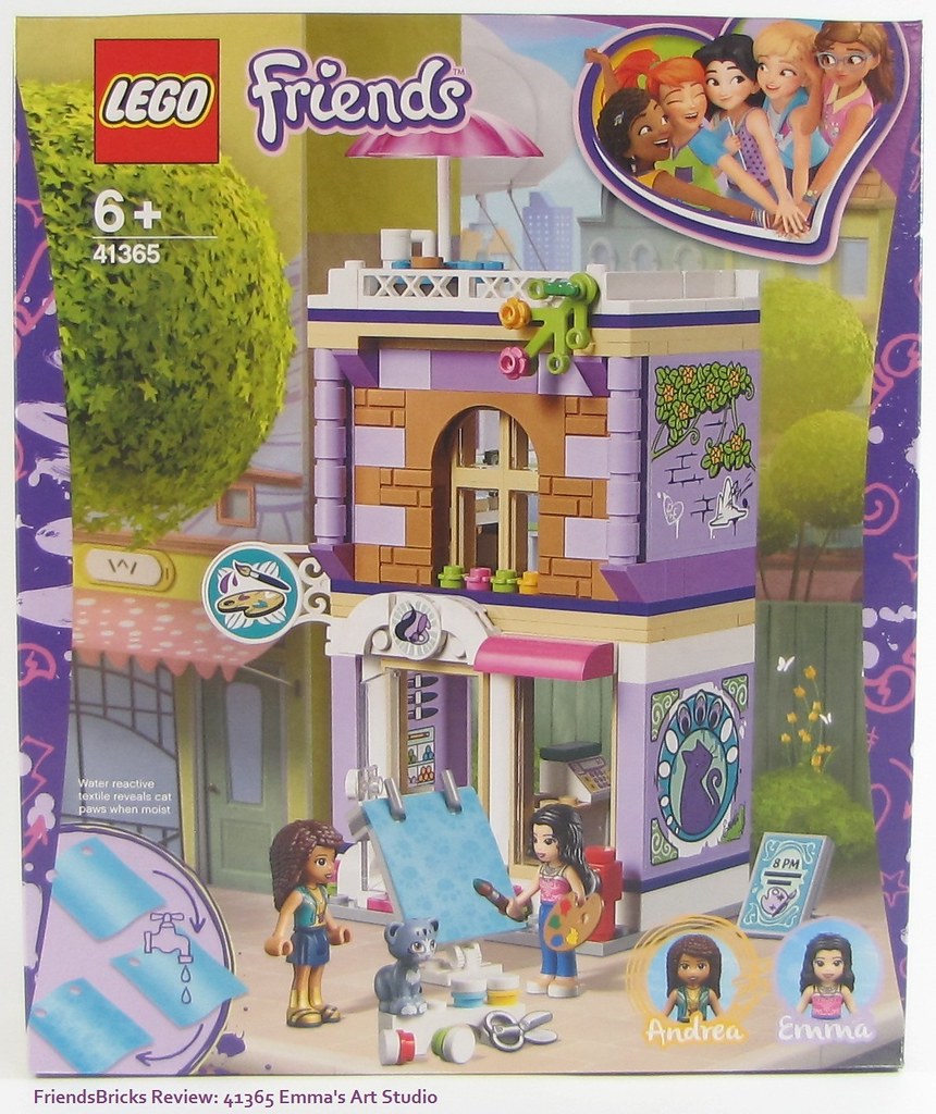
Box front shows Emma's Art Studio in a downtown Heartlake City setting as a corner building. This box has purple flange graphics, yet they are not physically indented like most Friends set boxes.
The bottom left insert tells us that her canvas is "water reactive" and will reveal cat paw prints once wet.
Andrea has come by to visit and watch Emma paint -- as Chico is mischievous as ever!
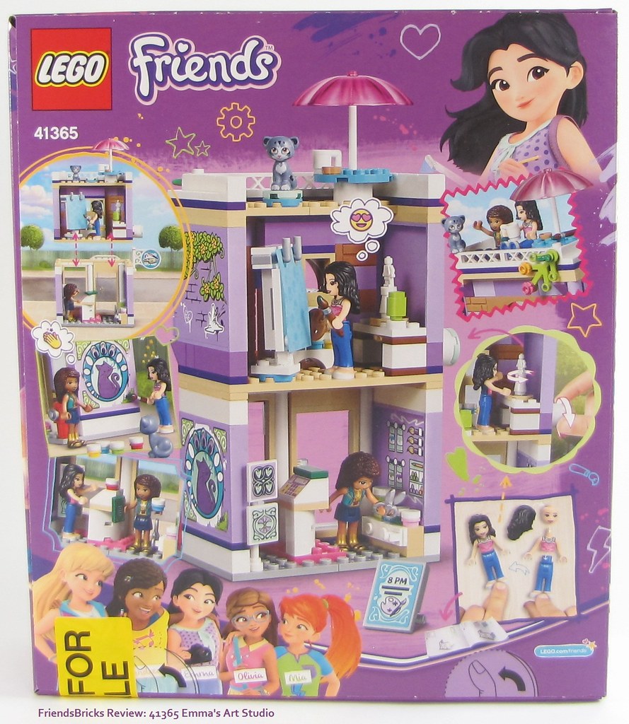
Box back gives a glimpse inside and the modularness of the building. Scenes and a demo of the rotating sculpting table.
Thumb pushes for opening are on the bottom of the box, which is rare. Due to the height of the creation, this box version is normally turned 90-degrees so the tabs are on one side.
The bright yellow not for sale sticker covers the UPC on the bottom (which otherwise, has no fun graphics) because it's been sent to me for review, and doesn't have the legal details USA required.
The upper right graphic of Emma is one of my favorites -- she looks so happy with wind-swept hair :-)

Scene slice side of the box is fun and helps know which set it is when on a shelf.

Top of the box tells about the new fabric (in 5 different languages), along with images of art accessories, Chico, and Emma showing mini-doll size ratio.

Side of the box with Emma and Chico next to a brick collage, LEGO Life ad, and the QR code which allows builders to access the instructions via an app.
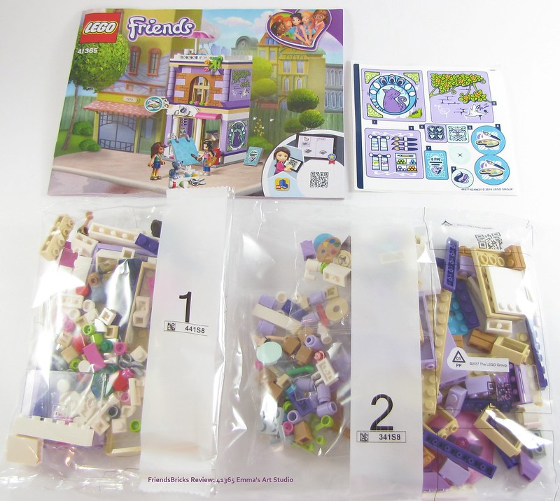
Box contents: 59-page instructions booklet, sticker sheet, and 2 bag of parts
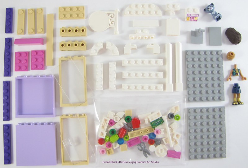
Bag 1 parts:
New of note:
Andrea's torso (we'll see more later)
Rare are the 1x2 white bow (curvy) tiles [small bag, upper right corner, upside down] as they only come in 2 other sets, Cloud City and Corner Garage - both quite large sets
Not new or unique to this set, however, it's worth mentioning the 1x4 tan plate (smooth like tile) with 2 knobs is welcomed because they encourage modular building -- to me anyway -- and I hope they come in all colors one day -- so far they come in @ 22
As with all Friends sets, we *build* our characters mini-dolls first! So I built lovely Andrea, and placed her nearby to keep Chico out of trouble while I finish this build.
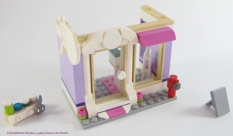
Bag 1 parts build the bottom floor module; here is a view the front -- with the art supplies cabinet we build independent of the structure -- then install. I love that!
So far I am very happy the designers are incorporating more smooth tiles in Heartlake City buildings. Younger builders need this, and we older builders want this!
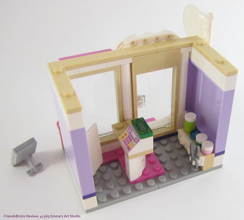
Bag 1 parts build the bottom "store" module; here is a view inside with the art supplies cabinet installed. I like the curvy counter, as it makes smart use of a small space.
Although the instructions call for them, I haven't applied any stickers just yet ... don't worry, I will. I am curious as to how the building will look without any. Mainly because it seemed quite over-whelming to me when I first saw the box images.

Bag 2 parts:
New of note:
Medium azure Water reactive textile fabric is new, called canvas with 2 holes, is still in its envelope-box (Emma's hair piece is on top to keep it from any micro dust on my photo board; I find hers is the most difficult to keep pristine)
Emma's torso is new (small bag)
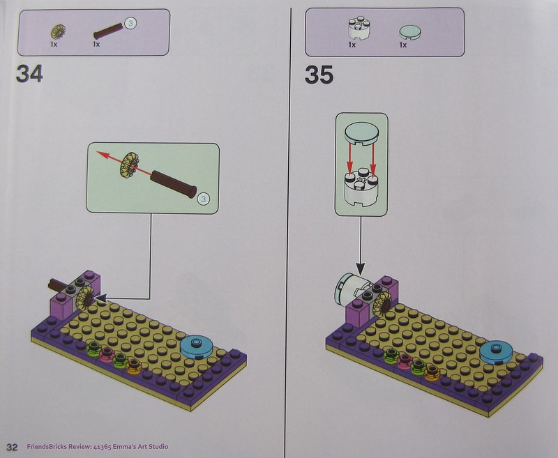
Upper floor build begins with installing one gear of the turning mechanism for the sculpting table.
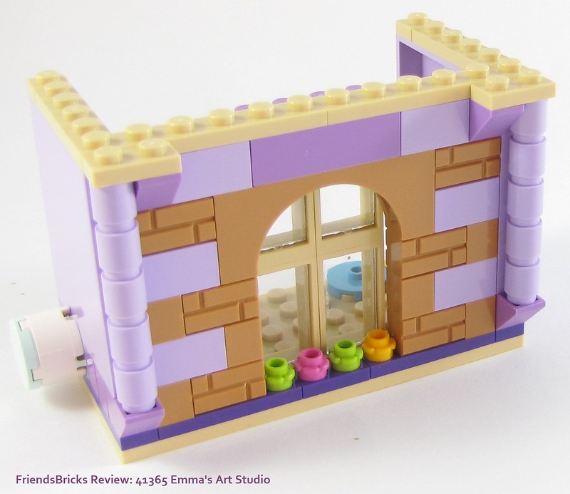
You can see the aqua tiled round knob for turning the sculpting table from the front of the upper floor module.
The designers could have just used Lavender columns here, yet the columns built of five 1x1 round bricks add more details common in downtown buildings.
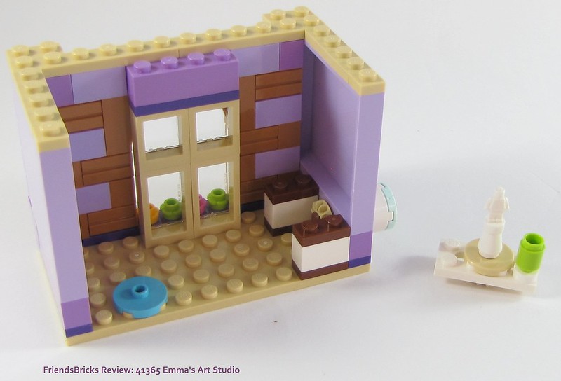
Inside the upper floor "studio" part of this building we add the bases for the sculpting table -- which we build independently, then install.

With the sculpting table installed, we can turn aqua knob and rotate this cute minifigure trophy ... err, I mean Sculpture!
This is all the building before the roof gets added, which is not modular, merely built onto. Before I begin that though, I see I missed connecting a 1x4 dark Lilac plate on top of the 1x4 medium Lavender brick above the windows -- oopsie.
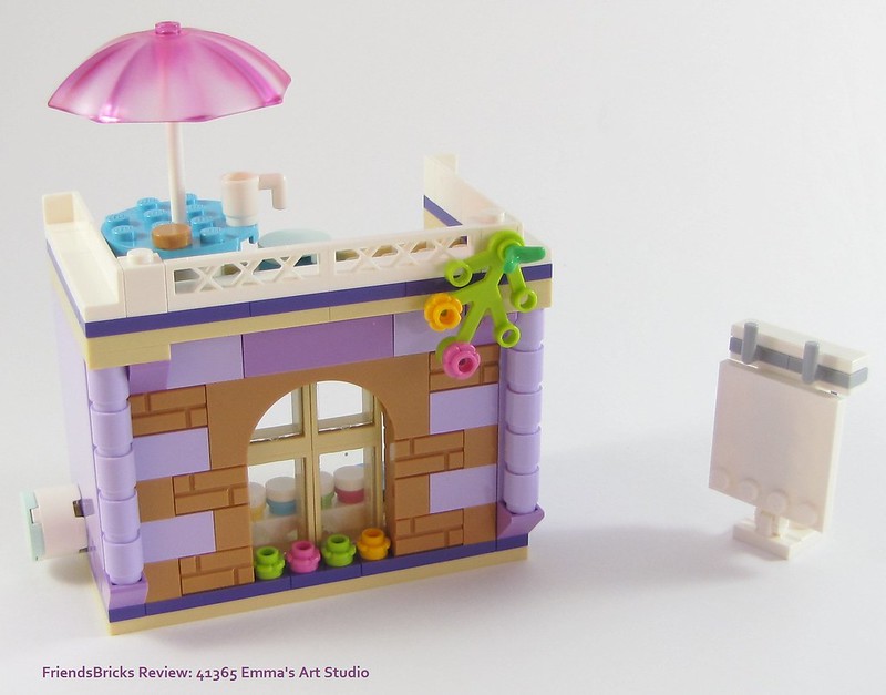
We build the rooftop patio for the table with umbrella and stool, then last we build the easel for the "magic" fabric canvas.
I like the blending the Lavender and medium Lavender bricks in this creation; all the colors together add to the style of artwork.

To finish the top module, we install the canvas easel into the studio. We've already built and installed the window-sill paint jars section.
While the patio may be small, it allows access to the studio room.
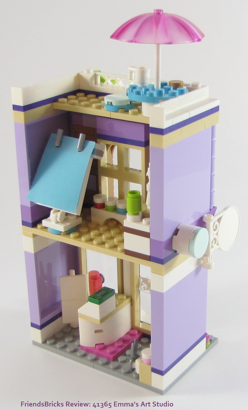
Both modules complete and connected, inside. Pre-stickers, because I wanted to show it clean. The easel with the water-reactive textile can swivel.
The green container for clay is an interested color choice; tan or nougat might have made more sense.

The building is complete, except for stickers. The front studio window is an excellent example of what we'd see in a downtown building with an artist studio.
I love the tiled front door stoop. Those 1x1 corner tiles aren't just for pizza any more! They really do add that extra detail Friends fans want.
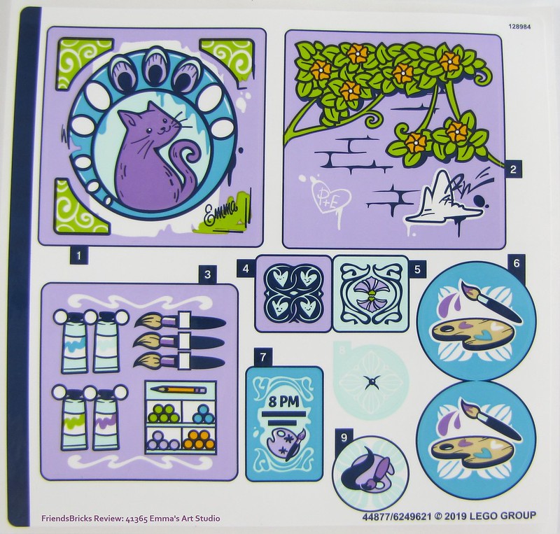
Sticker sheet has beautiful graphics, naturally, and a few mysteries!
The large cat graphic reminds me of 70s art.
My favorite is #4 though ... I think because it reminds me of Elves.
So, who is "P"?
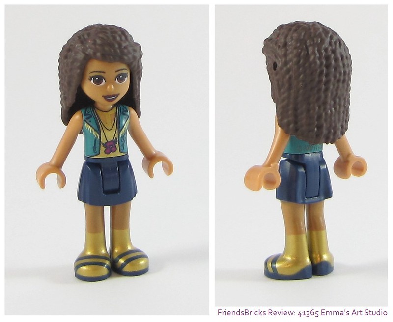
Andrea has a new top in gold with cutouts on the upper chest and a teal vest with fringe on the collar. Her magenta music note with wings necklace is a fun way to show her signature motif.
The back of her vest is solid teal.
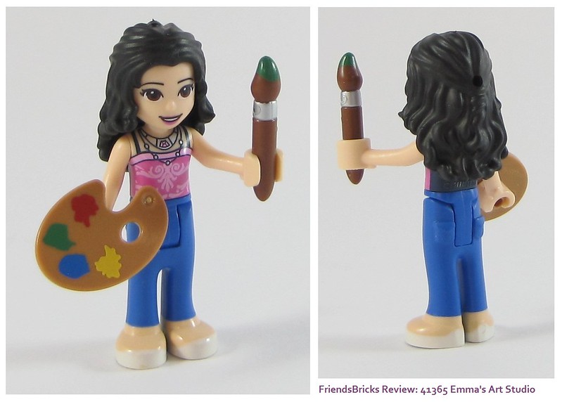
Emma is shown here as the instructions say to build her. Her top is new with a beautiful scroll design, somewhat Art Nouveau in style. She has a choker type of necklace with a gem inserted above a loose pearl strand.
The back of her strapped shirt is solid navy.
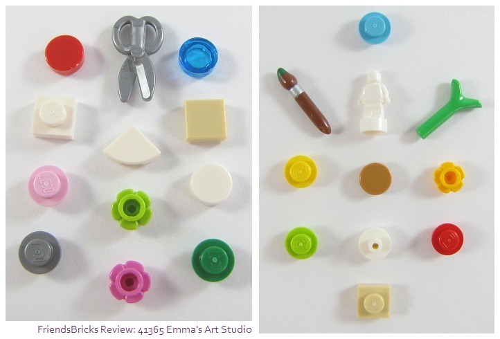
Spare parts from both bags include many very useful, and one rare! I do wish the paint brush tip had azure paint though; it would make more sense, and it's in TLG inventory.
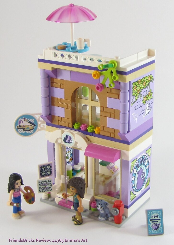
One more look at Emma's Art Studio completed for you to see and imagine being downtown Heartlake City. The upper side wall sticker replicates the vine growing on the front -- a nice continuity.
Through the open door we can see the sticker with paintbrushes and supplies for sale above the brick-built paint cabinet.
Andrea is looking for the small art pieces Emma just brought out front for exposure and a final touch up.
The bottom artwork on the display stand is very Art Nouveau, as is the huge cat mural on the side wall!
Chico is guarding the fire-hydrant in case of any stray dogs ;-)
Summary:
A solid build that is more sweet in person than any images. The modules have straight forward construction, yet detailed in design. When connected, the building is sturdy enough to move around without any issues. Building in modular style is good for re-arranging, yet also for making it easier to access rooms. For AFOLs, our larger hands need this.
Even though it doesn't come out until the end, the fabric provides the play factor intended for the target audience. It would be nice if it revealed actual artwork, yet kitty paw prints are popular with kids.
I would say this would make an excellent first Friends set for anyone. It doesn't take a huge amount of time to build, and would fit very well into any City layout -- especially a downtown setting. Maybe next to a Diner with teal and pink Art Deco decor?
Although the overall footprint is not that large, it seems bigger with all the details. The overall style could easily be built on a grander scale.
As much as I loved her Art Cafe 41336 from last year (and to re-build it), I think this set is the most "Emma" of all :-)
~~~

3 comments:
Wow. The eight-year-old girl in me wants this set sooo badly! And even the "grown-up me" wants to slip into Emma's world and play in that studio ALL DAY LONG. Such lovely architectural details and fabulous graphics on the stickers. Emma's color palette really shines in this set! Thanks for the comparison pics of with/without stickers. That's interesting to see!
Eh, I honestly don't think the set seems that good. The general concept for an art studio for Emma seems interesting given the previous release of her fashion design studio (2012), her creative workshop (2016), and her photography studio (2017). However, I am unimpressed by what is presented in this set. While the structure of the outside of the building has gorgeous architectural details, the interior design falls short. For one, all three floors are cramped and barely leave any room for the minidolls to stand in various positions. My other complaint is that there aren't many features inside either. The first floor only contains a cash register and a stand for paint jars, the second floor has the clay sculpture and fabric, and the third floor simply contains a table and stool. I feel that it would've been more worth it if the building was much larger and contained more artistic play features, even if they were repeats of things we may have already seen in Emma's other art studio mini sets. Unfortunately, the designers put such a great emphasis on the exterior of the building and the water reactant fabric that were unable to put as much attention to detail on the inside as well. In my opinion, the lackluster amount of play features and small amount of space in the rooms of this set leaves a lot to be desired, however since it's only $20 if this set is ordered on Amazon Prime, some people may be more inclined to buy this set, while others may end up purchasing this set for the full $25 for the exterior look of the building alone. I am not either of those people.
-T.L., a TFOL who grew up with the old sets who may or may not still play with them on a weekly basis.
I've already owned this set for 2 years, but I feel a late comment is necessary.
Great colour scheme! A simple two storey plan, but good architectural ideas. Beautiful graphics with the stickers! A modest price. What's not to love.
Now if only Lego would offer a couple of structures such as this - but slightly wider and with a bit more depth so it wouldn't be so cramped; not too many colours; I am sure it would be a decided success.
Maybe even City fans might be attracted. -KW (AFOL)
Post a Comment
Note: Only a member of this blog may post a comment.